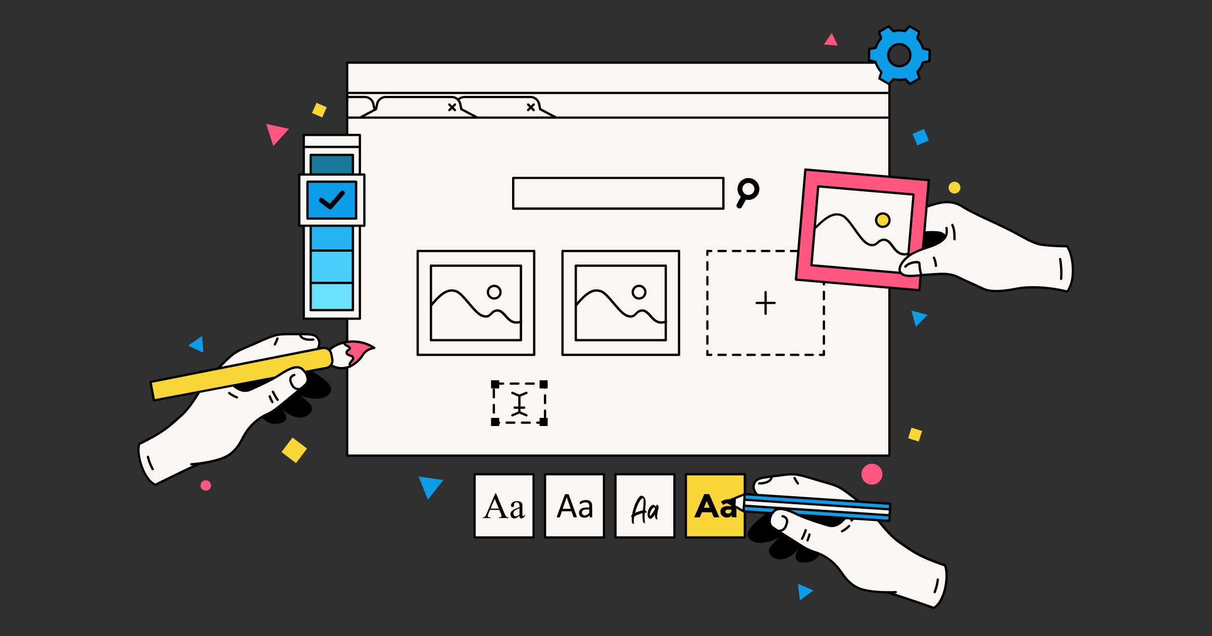
UI Tips
Grids
Design is mostly about alignment and grids help you align your UI faster and with more confidence.
Unless you start right in code, it’s a good idea to use a grid system for your client designs. Most designers use an 8px grid which makes alignment and things like padding and margins easier than having to eyeball everything.
Why 8px grids? Because they calculate nicely into most resolutions and make your elements look properly scaled and positioned.
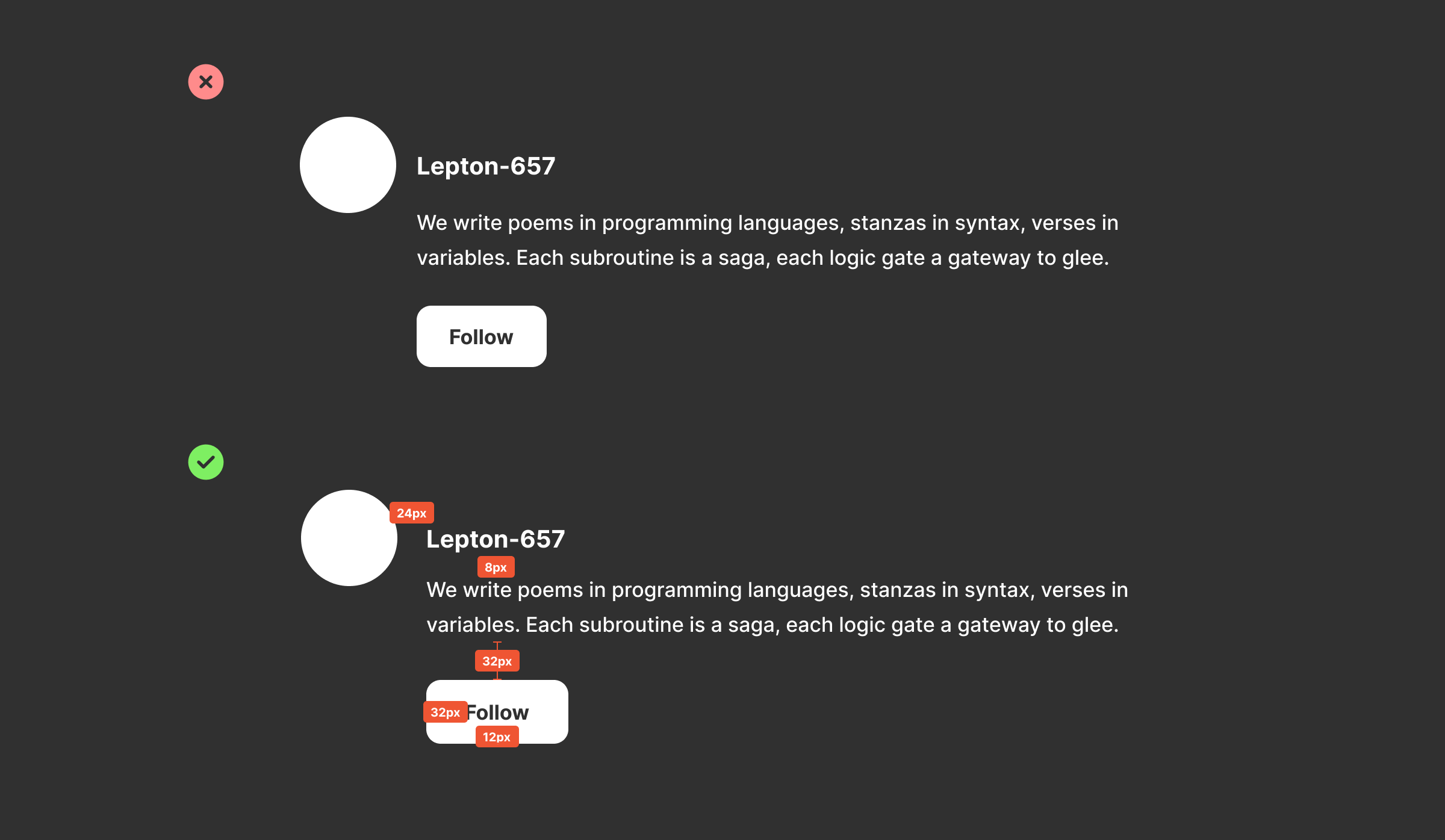
However, there are times where you need to step down to a 4px grid for smaller UI elements where information density is important or you have limited screen real estate.
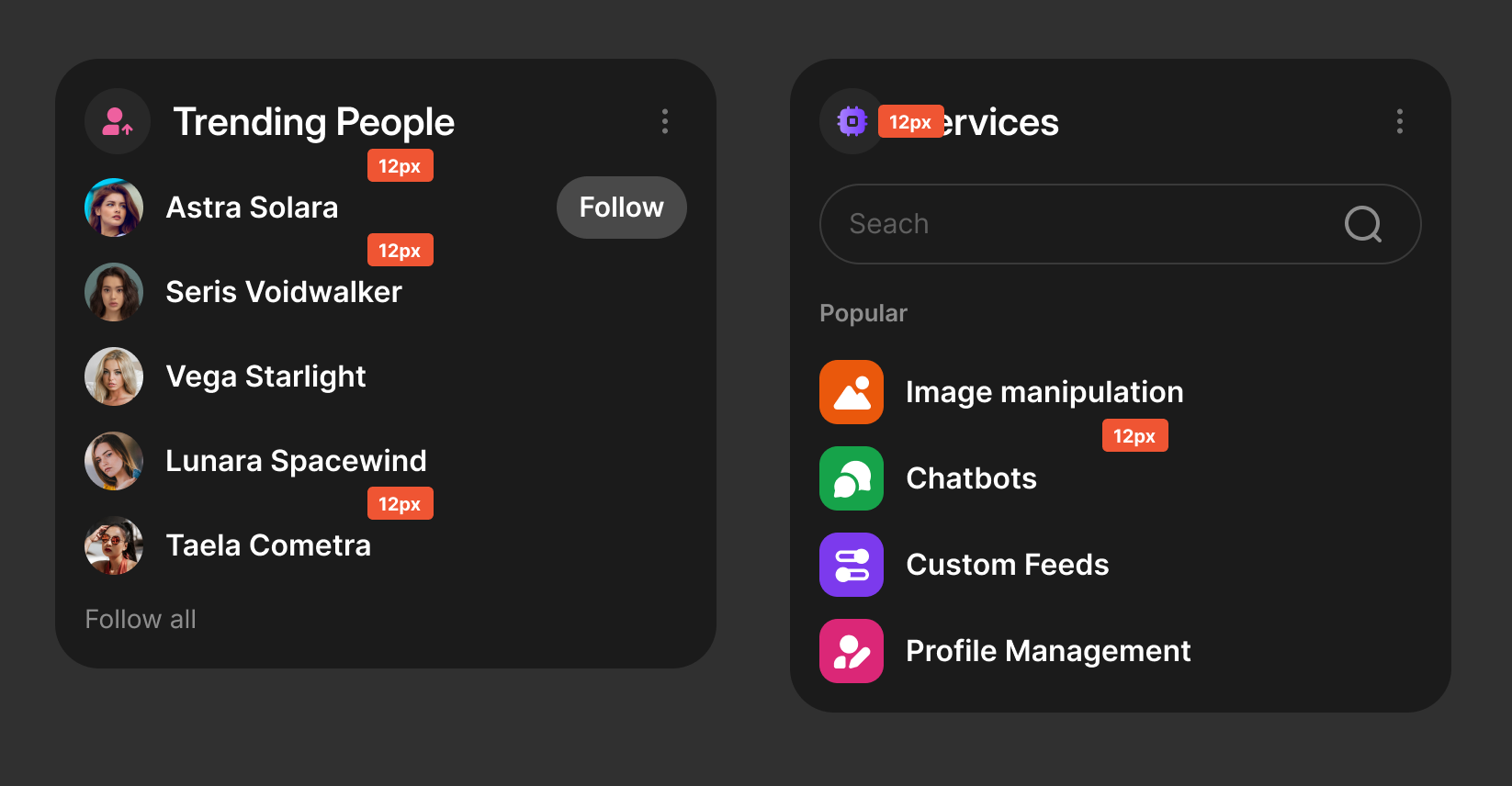
If you use Figma for designs, you can set your nudge amount to 4 or 8px so that it automatically steps your nudges by the correct amount.
Borders
Unless you are following a brutalist style design or something that specifically calls for borders on your elements, it is a good idea to reduce the number of lines on the screen.
There will be times for things like note lists where you absolutely need borders and cannot minimize them, but most modern design aims to reduce borders.
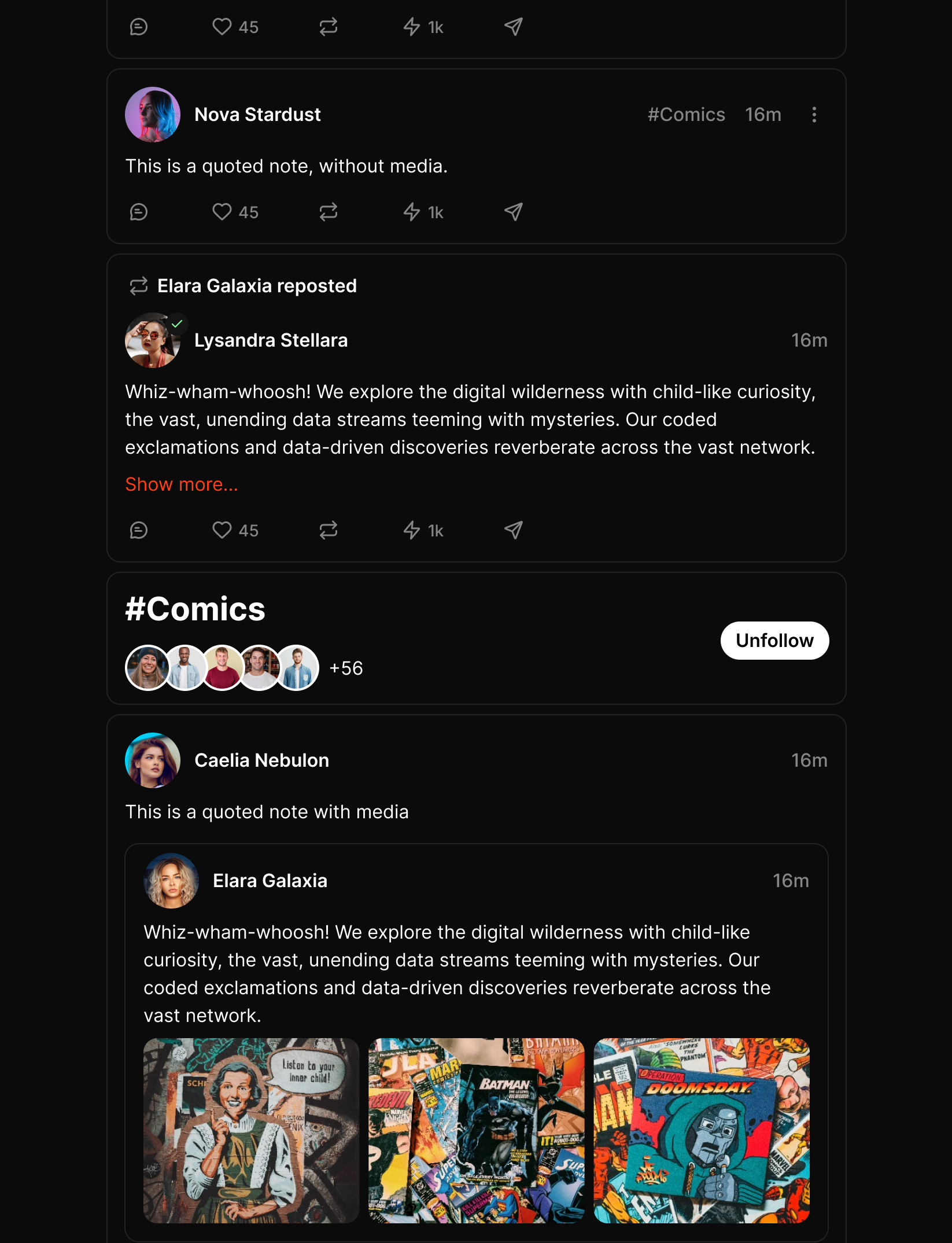
In the example below, we see that a Twitter-style client cannot do away with borders without sacrificing readability / easy scanning.
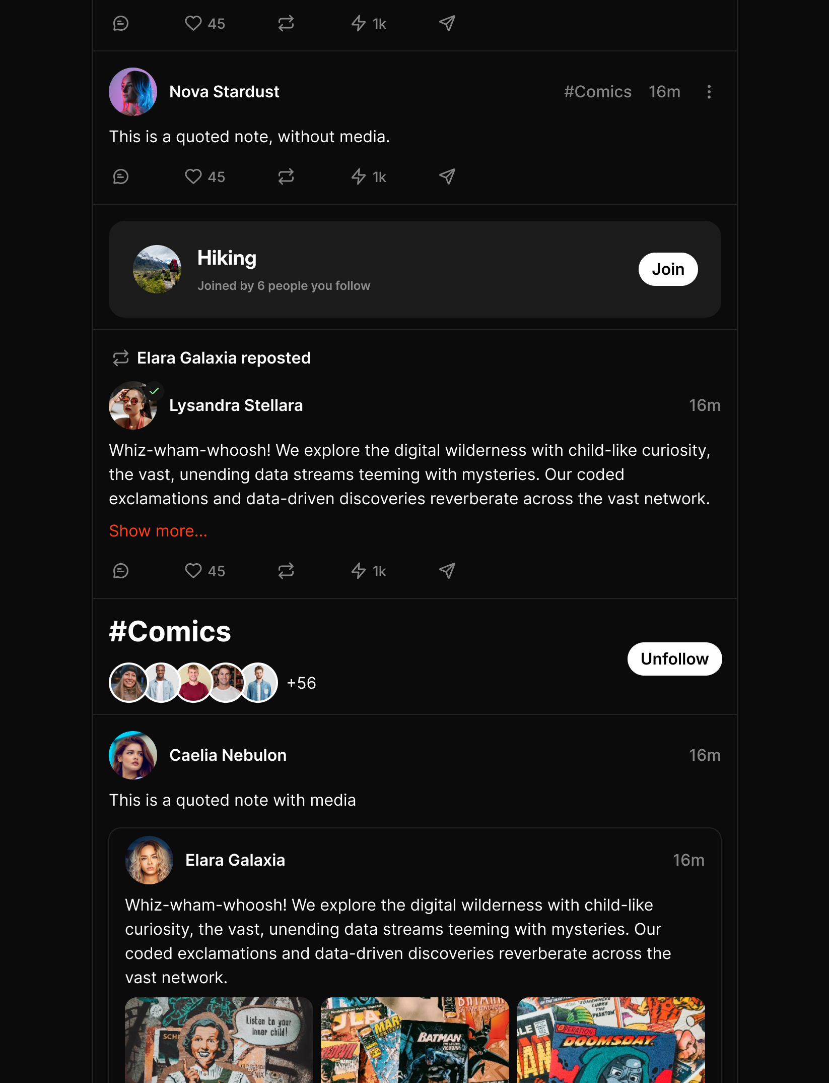
Here is an example where each note having their own border quickly becomes distracting and makes the UI look busy. Browsing this feed for a long time would be tiring on the eyes.
Things to watch out for with borders
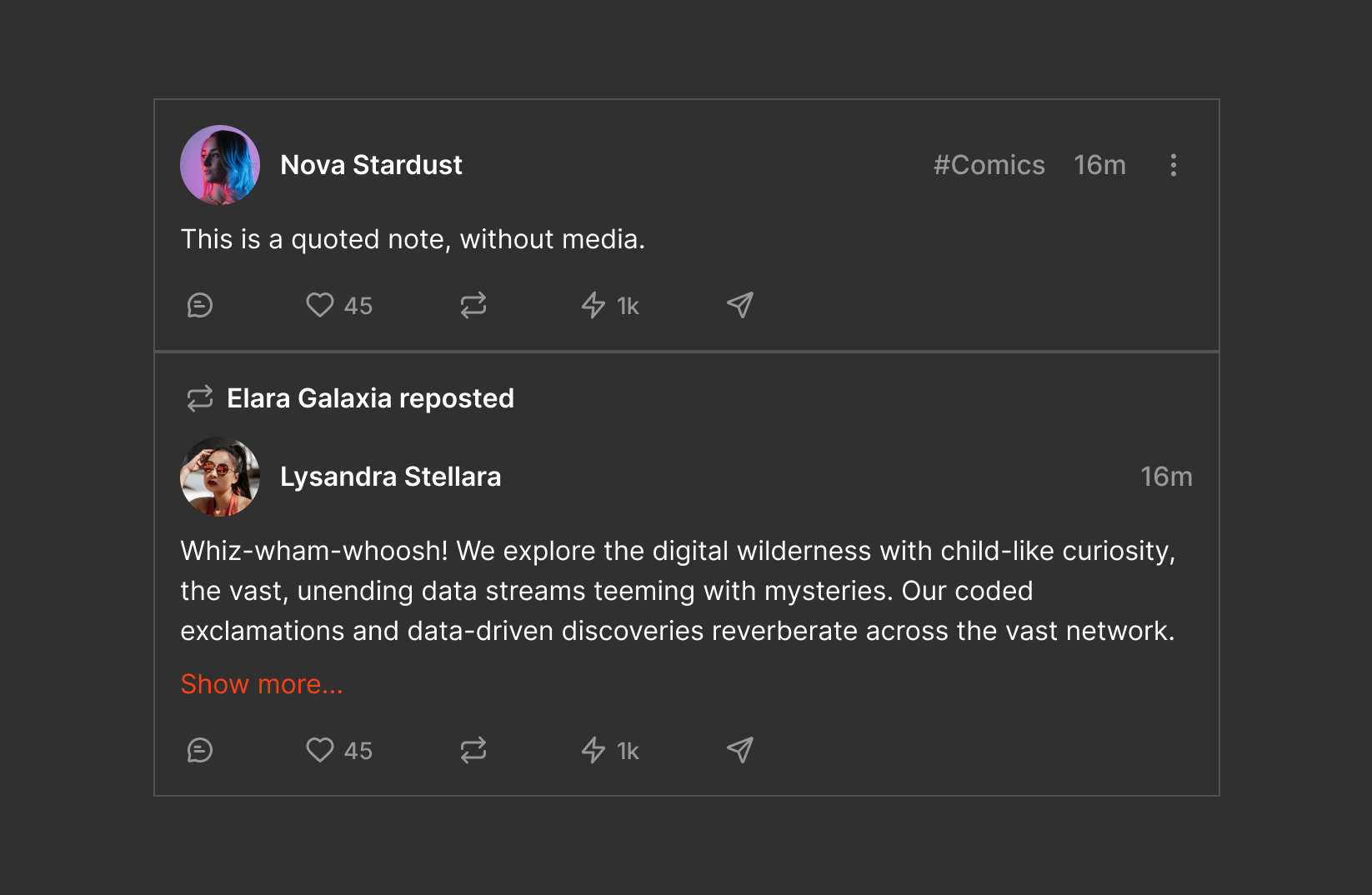
Border color and width consistency - try to keep your border color and width consistent throughout the UI. There will be places where your border must be lighter or darker (for example on a modal), and that’s fine.
Double borders - When two elements have borders, it’s possible that some may overlap, creating double borders.
Corner Radius
Corner radius has been introduced into most UIs to reduce the visual strain of the eye focusing on the edges of an element. Adding a slight corner radius lessens eye strain, improves scanning and makes for a more pleasant experience.
There may be times where a sharp corner is justified or if your design style calls for a more serious, premium look.
Typography
Even the best UI and UX in the world can become unusable with the wrong typography choice. Here are some best practices to help you choose the right typography:
- Use san-serif fonts: Occasional Serif for a touch of elegance is totally fine, but generally speaking app UI works best with sans-serif fonts.
- Use fonts with taller x-height: Fonts with taller x-height are more legible in smaller UI. When in doubt, go with one of the typically recommended typefaces that are known to have good readability.
Typeface Choice
The following is a list of fonts that generally work well in UI design:
- Inter (most common)
- System fonts (SF Pro, Segoe UI, Ubuntu)
- Manrope
- Outfit
- DM Sans
- Public Sans
- IBM Plex Sans
- PT Root UI
- Roboto
- Figtree
- Hind
- Fira Sans
- Nacelle
- General Sans
- Source Sans Pro
Scale
Typeface choice is only half the puzzle. You must also use the appropriate scale for your UI. Coming soon...
Legibility
Coming soon...
Color
Color is a massive topic that has roots in human psychology and physiology. Color choices can impart different feelings to different people. Here are some practical tips for color in app design:
- Use neutral colors for user-generated content. When designing around user-generated content which may contain the entire spectrum of colors (via images or video), it is generally safer to use neutral color tones (gray, black, white). You may have noticed this from large scale apps - they are either white or black and sometimes gray. This is because the neutral colors allow the content to speak for itself and play well without distracting the user.
- Keep color choices to a minimum. A primary, secondary, and a tertiary colors are usually all that is needed for highlighting various elements.
- The more opinionated your app colors, the fewer people will be happy with your choice. If you design a blue app, people who hate blue will not want to use it. If you design a pink app, pink haters will despise it. If you really want to see a variety of colors, consider using gradients.
- Consider how various colors make you feel - blue for safety, golden for luxury, beige for a natural feel, green for money, pink and purple for fun.
- Design in line with your industry (for the most part) - if you are designing a banking app, you probably don’t want to go hot pink. A safer blue or green and white might do better.
- Layer your colors - in nature, the further the object, the darker it is unless it’s highly reflective. We can apply this principle in design by layering elements with darker colors in the back and lighter ones closer to the user’s viewpoint. For example, cards and modals should be lighter in color than the background of the page.
- Use accent colors instead of a new color. When you need another color, chances are you’re better off using an accent color (a different hue of the same color). For example, you will often find apps with different colored backgrounds from the card (the content) that sit on that background. This is a perfect example where a different shade of the card color would have worked better.
Line Length and Height
One way to ensure your text is always legible is by setting the correct line length and height. Many clients fail to apply the appropriate line height.
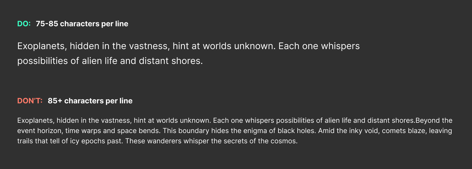
The general rule is a maximum line length of 75 characters (including spaces), up to 85 characters should you need to exceed 75. Anything more and our brains have a harder time when jumping to the next line.
To calculate line height, apply the golden ratio to your font size and desired characters per line. In many cases, your UI elements will contain much fewer than 75 characters.
Resource: https://grtcalculator.com/