Guiding Principles
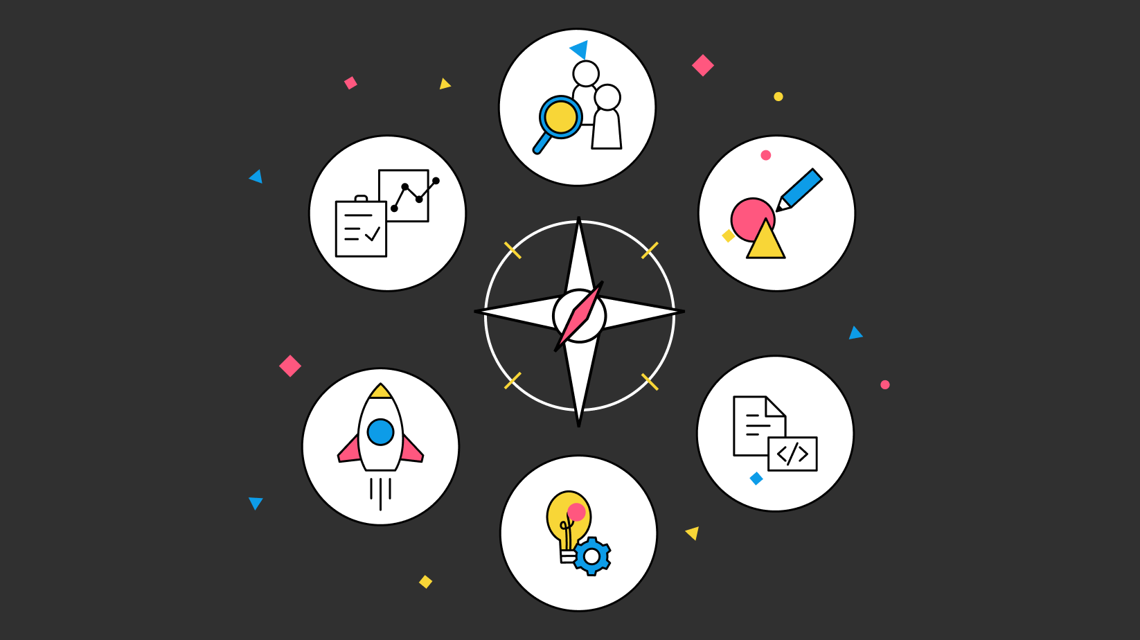
Use this page as a cheat sheet for the guiding principles of Nostr. These principles are meant to help you make decisions about your client and to help you understand the reasoning behind the design decisions made in the reference designs. They also serve as a quick reminder - a north star so to speak - to keep you focused.
Nostr Guiding Principles
User Sovereignty
Nostr is based on the idea that users should have control over their data and their experience. This means that users should be able to choose how they interact with the network, what they see and how they see it. As designers and developers we aim to prioritize user choice above all. In practice, this means:
- Users can always choose which relays to join or leave
- Users can always choose which topics to follow or unfollow
- Clients should avoid censoring anything they disagree with. Instead, they should give users the option to filter out content they do not wish to see.
- Users must retain control over their private keys. No client or company should lock users into their platforms by "holding on" to the user's private key.
- Users should be able to choose how they interact with the network. This means that clients should not force users to use a specific relay or a specific set of relays. That's not to say that clients cannot select a few starter relays, but users should have complete control over adding or removing them.
- Opt in vs opt out. Clients should not automatically opt users into following certain topics or people. Instead, they should give users the option to follow or unfollow topics and people.
- When possible, allow users to skip onboarding steps if they are not totally necessary such as creating a starter topic-based feed.
Make Use of Interoperability
Unless your explicit goal is to build a do-it-all client, consider leaning into the modular nature of Nostr and building a smaller client that does one thing really well. This will allow you to focus on a specific use case and provide a better experience for your users.
Focusing on specific use cases allows other developers to tap into existing clients and build integrations instead of recreating them from scratch. Think of nostr as a network of components that can be re-arranged in many different ways to create new experiences.
For interoperability lessons learned, refer to Nostrability - a crowdsourced repository of nostr interoperability (or lack thereof) knowledge. Devs, designers, and product contributors are encouraged to actively identify negative interoperability issues, and track & advocate for positive interoperability across many nostr apps. Reach out to elsat, nostrability product contributor, to get started, or simply participate in the Nostrability github! Feel free to use, and follow the #nostrability tag on relevant nostr posts.
Keep it Flexible
Try to give users options to customize their experiences.
- Allow users to change appearance settings such as light and dark mode, font sizes.
- Let users choose if they are right handed or left handed and adjust the UI accordingly.
- Give people options to opt in or opt out of various types of notifications instead of grouping them under one "Notifications" toggle.
- Allow users to specify information density if possible.
Design Principles
Fastest Path to Awesome
The fastest path to awesome is the path that gets the user to the "aha" moment as quickly as possible. This means that the user should be able to get started with the client as quickly as possible and experience the value of the client as soon as possible.
Keep it Simple
Simplicity wins. Keep the interface as simple and intuitive as possible. Exceptions include tools designed for power users or for dense information.
- Minimize the number of steps to accomplish a task.
- Minimize cognitive load. Instead of offering every option under the sun, consider offering fewer core options and allowing the user to discover more down the road. Often, less is more.
- Use progressive disclosure to ease the user into new concepts instead of laying it on them all at once. For example, you could guide users to understanding of relays, zaps and other concepts by slowly introducing them with tooltips or a resource center.
Make it Fast
Even the best designed and feature-complete client in the world may be all for nothing if it's slow and nobody can use it. Performance is a feature and can make or break your client and all of the effort you've put into it. Consider the following:
- Utilizing caching when possible
- Optimizing images and other media. Check to see the size of the media being loaded and if it can be optimized further.
- Structuring the views in such a way that prioritizes performance by loading the most important content first.
- Use skeleton loaders and other techniques to make the app feel fast even if it's not.
Use PageSpeed Insights to regularly test your client for issues.
User-Centric Design
Focus on the needs and experiences of the user throughout the design process.
- Add feedback collection mechanisms to your client that allow you to collect feedback from your users.
- Consider adding a simple form besides a typical link to the GitHub issue submission page.
- Build in open and ask for feedback early and often.
- Treat complaints as great opportunities to improve your client. Do not minimize the user's experience or feelings. Never lash out at users for providing feedback, even if it's not constructive.
- Try not to get attached to your own work. The preferences of many should supersede your own. Stay flexible and update the UI based on user feedback.
Make Your Most Important Asks Prominent
Consider what each page or view should help the user accomplish. What is the most important action you want the user to take? Make that action prominent and easy to find.
- Use color and visual hierarchy to make the most important actions stand out. For example, if you have a long-form client and the point is to share content, make the share buttons easy to find and prominent.
- De-emphasize secondary actions via visual design.
- If it's hidden, it doesn't exist. Make sure the user can easily find the most important actions. If they are hidden under menus, consider ways to bring them out into the open.
Avoid Jargon
Avoid using jargon or technical terms when possible. Instead, use simple and clear language that is easy to understand. Nostr has a lot of technical terms and concepts that may be difficult to understand for new users. Consider how you can explain these concepts in a simple and clear way. For example, equate private keys to passwords, relays to servers, NIP-05 handles to "nostr addresses" and zaps to payments. Use descriptors to explain what things are and how they work.
Provide Feedback
Provide feedback to the user when they take an action. This can be done in many ways:
- Use a loading indicator to show that something is happening
- Use a success message to show that the action was successful
- Use toast notifications to indicate something has happened
- Use clear error messages to indicate that something went wrong
- Use tooltips to explain what things are and how they work
- Add hover states to buttons and other elements to indicate that they are clickable
- Use animations to indicate that something has happened
- Use color to indicate that something has happened
- Add micro-interactions to make the app feel alive and responsive
- Occasionally use sound effects to indicate that something has happened. Don't over do it - stick to simple sounds and only when appropriate. For example, pull to refresh could have a sound effect.
- Make use of skeleton loaders to indicate that something is loading
Maintain Consistency
Maintain a uniform design throughout your client. This means that the user should be able to easily recognize the same elements across different views. For example, if you use a certain color for buttons, use the same color for buttons across the entire client. If you use a certain font for headings, use the same font for headings across the entire client. Create components that follow a design system and apply the same hierarchy, spacing, color usage and other design elements across the entire client.
Stick to Known Patterns When Possible
You won't always be able to stick to known patterns, but when possible try not to reinvent the wheel by creating an interface that has no reference anywhere else. This will make it difficult for users to understand how to use your client. For example, if you're creating a mobile app, consider using the native navigation patterns and other native elements.
Make it Accessible
Design for all users, including those with disabilities.
See the resources page for a list of accessibility tools and resources.
Consider the following:
- Use color contrast tools to ensure that your colors are accessible. WCAG AA is the minimum standard that designers should aim for.
- Use accessible colors to ensure that your text is accessible
- Opt for UI-friendly fonts that are easy to read. Avoid using decorative fonts for body text.
- Consider things like touch targets - making buttons large enough to be easily tapped on mobile devices. Check that your links are spaced sufficiently to avoid accidental miss-clicking. Ensure that you have sufficient spacing to the edges of the screen to make for easier tapping of links.
- Use alt tags for images and other media to describe the content.
- Use semantic HTML to ensure that your content is accessible to screen readers and other assistive technologies.
- Keep your labels clear and simple. Avoid using jargon or technical terms.
- Provide a way to skip to the main content for screen readers.
- Consider keyboard shortcuts
Minimize Errors
Users are bound to make errors. Anticipate what errors they may come across and offer ways to correct them. Showing too many error notices when user is doing what is asked of them may turn them away from your client.
For example, displaying an error when a person fails to upload an image in onboarding can be mitigated by not making the profile image a required field. Instead, you could use a placeholder image and allow the user to upload one later.