Sharing
Sharing outside of nostr makes nostr grow faster. I didn't mean to rhyme, but it's true.
So, let's build in some sharing features to help people share their content and media outside of nostr!
Sharing on Nostr
Some clients already do a great job with content discovery by surfacing different types of notes. Amethyst and Snort automatically show recent streams started via ZapStream.
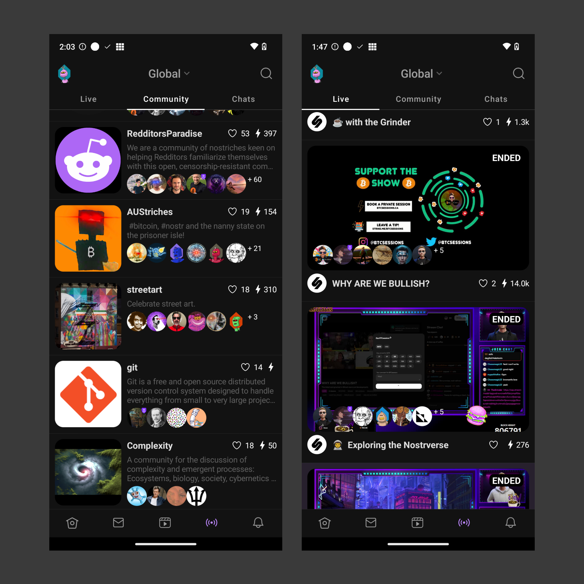
Unless your goal is to build a single-task client that does one thing well, interoperable content such as streams, chats and communities can be a great way to promote discovery within nostr.
Broadcasting from client to client
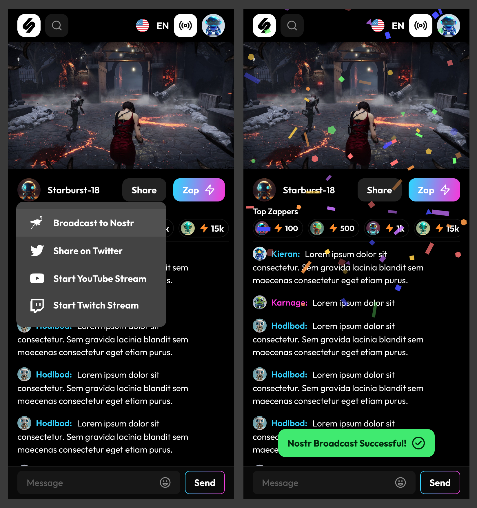
Sharing on nostr can also happen via direct action such as pressing a button to broadcast a note to nostr relays.
Sharing to Other Platforms
Developers building clients should always think about how they can enable users to share their content quickly and easily. Simple share buttons within a minimal / focused UI are a good way to achieve this.
In the example below, the UI is kept to the absolute essential buttons - play, zap, share. The simplicity of this interface encourages users to share what they are listening to. Pressing the 'Share' button could bring up a modal or a dropdown (dropping "up" in this case) to show the various share options.
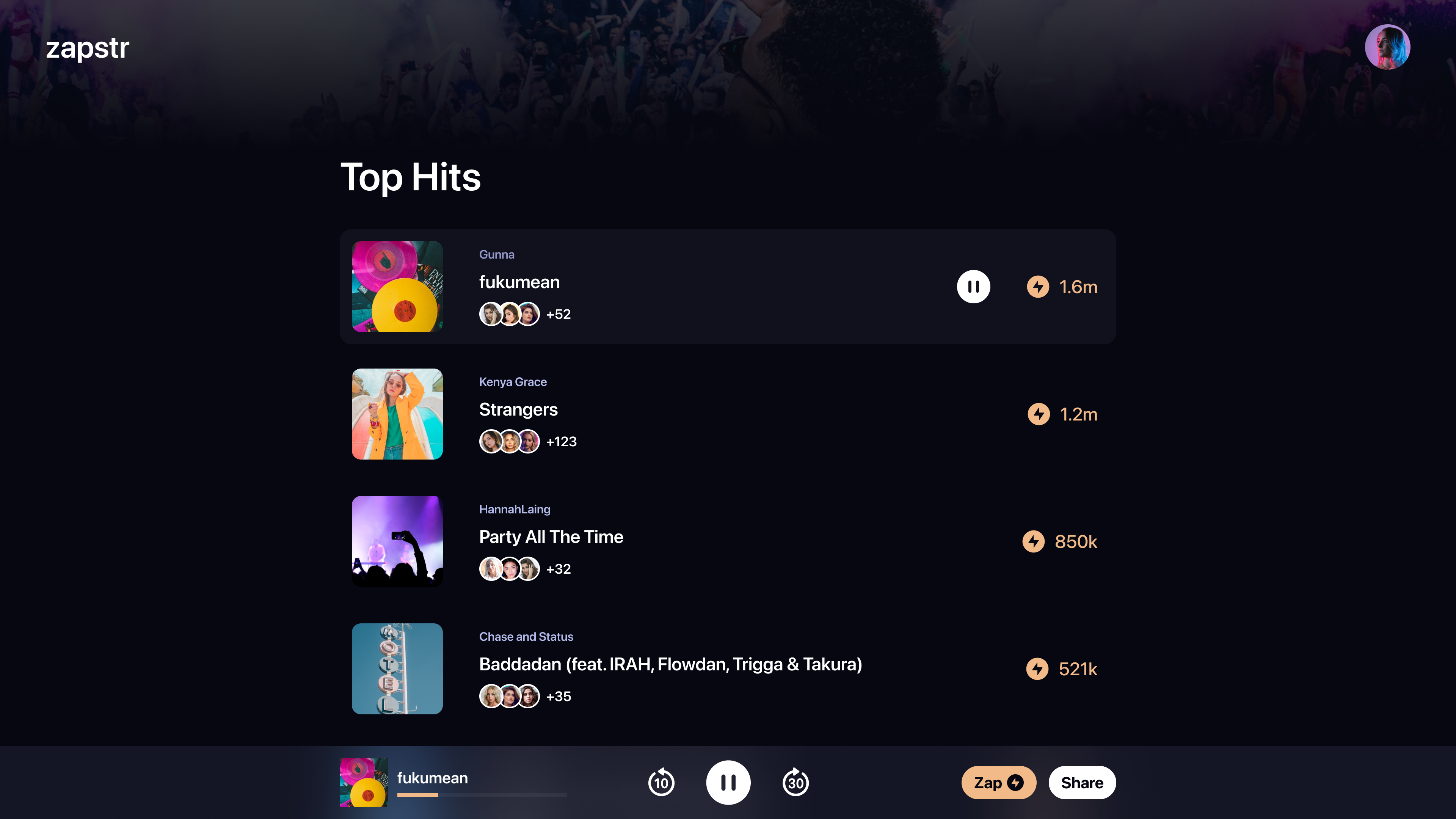
Think about which platforms make sense to include for your type of application, and create simple button dropdowns to share to those platforms.
Client UI Considerations
Less is More
In psychology, the "Paradox of Choice" is a principle that describes how too many choices can lead to indecision. We apply this principle in design by keeping interfaces simple and focused. One way to influence user behavior is by eliminating all other undesired options. If our goal is for the user to use the product and to share it with others, then we should eliminate all other options that do not contribute to that goal. In practice, this means minimizing button and UI options and making sharing the primary focus.
If it's hidden, it doesn't exist
"Out of sight, out of mind" draws origins from the concept of Salience. Noticeable, or visually important elements are more likely to attract our attention. In design, we can use this principle to our advantage by making the share button more noticeable. This can be done by making it bigger, more colorful, or by placing it in a more prominent location. Many user interfaces like to hide the share button under some menu. This essentially makes it more difficult for people to interact with it.
If you wish your users to perform some task, make it easy to start or difficult to miss in the overall UI.
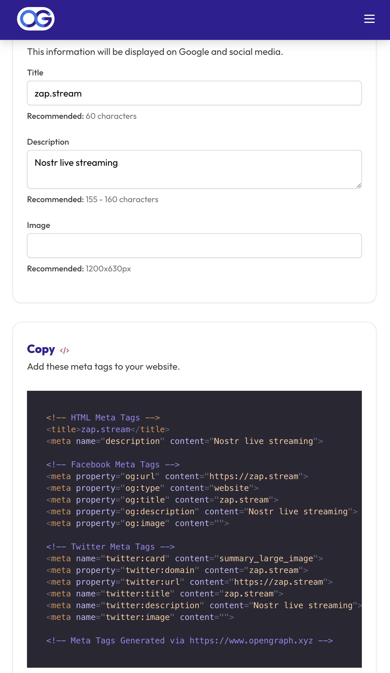
Open Graph Data
Studies have shown that including open graph data such as images can increase click-through rates. A Facebook study concluded that posts with images saw 2.3 times the engagement rates of those without images. And a Twitter study by Buffer found that tweets with images received 150% more retweets than those without images.
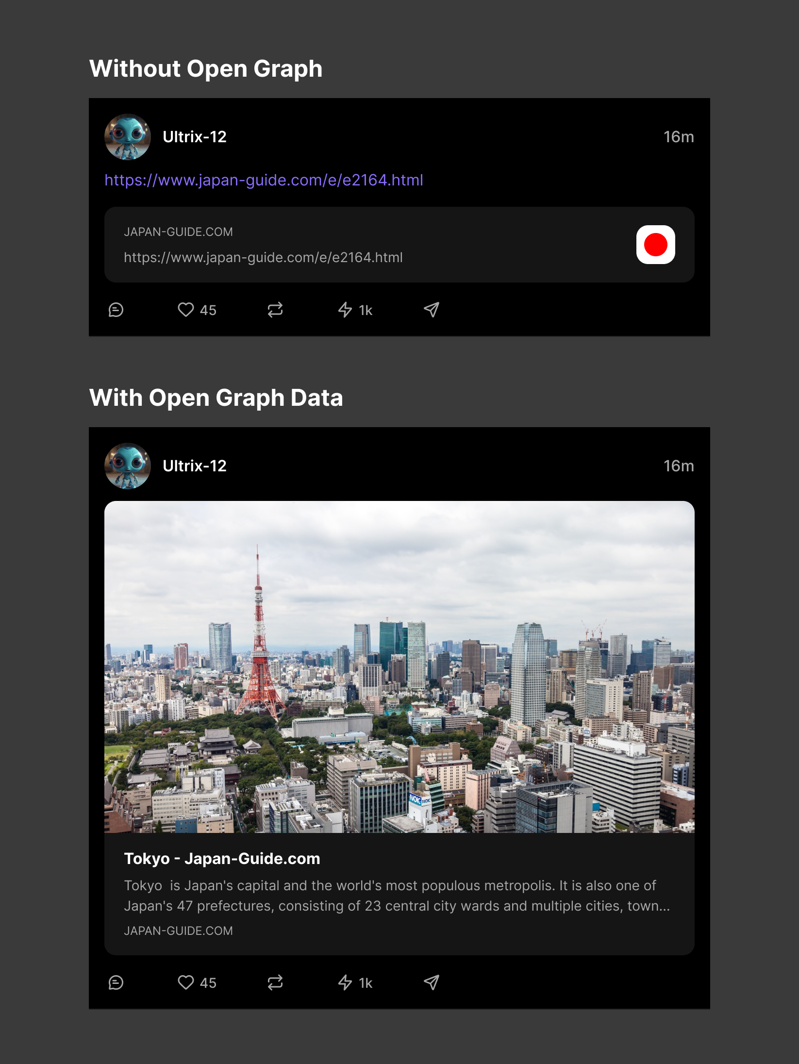
Enable Open Graph Data
- Check if your URLs are rending open data already. Visit https://www.opengraph.xyz/
- If the data is missing, the website will generate the appropriate static code. You may need to dynamically populate the fields for subpages.
